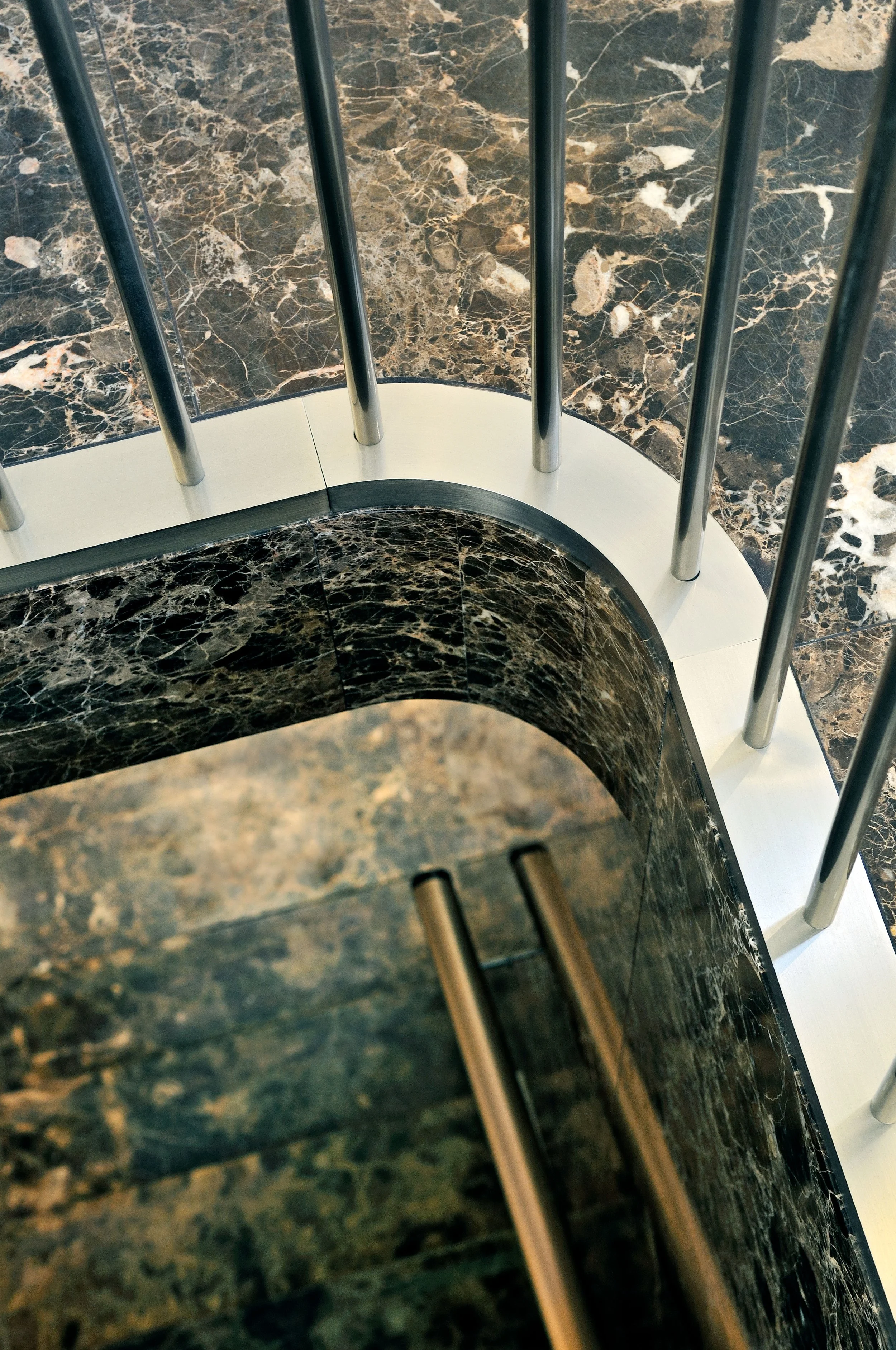
Marc Jacobs Paris
Paris, France
The challenge of this project was to insert a contemporary retail store into seven adjacent bays of the monumental Palais-Royal in the center of Paris. A series of formal strategies were used to create an architecture consistent with the client’s brand identity, even as it remained sensitive to the historic layers of the 17th-and-18th-century architecture of the building.
The existing spaces were combined to create a 1,700-square-foot continuous ground level that houses the store’s public spaces while the basement contains offices, stockrooms and support spaces. The primary goal was to open the space and unify the disparate elements within it.
-
This strategy was achieved through the modification of the structure of the building to allow for an open plan, replacement of the façade, enveloping millwork around the perimeter, and the repetitive use of ceiling vaults. The geometric irregularities of the layout were ordered through the positioning of three sales areas and their support facilities; arranged in a dumbbell scheme, the ready-to-wear sales areas occupy opposite ends of the space and are linked by a gallery of accessories that faces the garden.
The previous structural system of timber, cast-iron and terra-cotta was replaced with steel beams and four cast-iron columns. New front & rear façades were added directly to the arcade and the Rue de Montpensier, creating an important cross axis through the store that provides a sense of space beyond the boundary of the perimeter walls. The studio worked closely with the French Ministry of Culture and the Agence des Batiments de France to ensure the design met local historical requirements and to develop a new facade standard to be applied to future renovations of the Palais- Royal. A continuous wall of sycamore shelving unfolds to visually unify the sales areas and provide needed display space -its materiality, and scale provide an opaque counterpoint to the arrangement of nickel vitrines and glass facade that dematerialize the exterior wall it parallels. And throughout, the elemental form of the vault serves as a hybrid between both historic and contemporary architectural forms. The vault encapsulates the space and counterbalances the strong horizontal line of the store as well as the visual pull of the garden courtyard. Together, these interventions allowed for the emergence of a new contemporary architecture within an already layered history.
The studio worked closely with the French Ministry of Culture and the Agence des Bâtiments de France to ensure the design met local historical requirements and to develop a new façade standard to be applied to future renovations of the Palais-Royal. A continuous wall of sycamore shelving unfolds to visually unify the sales areas and provide needed display space – its materiality and scale provide an opaque counterpoint to the arrangement of nickel vitrines and glass facade that dematerialize the exterior wall it parallels. Throughout the store, the elemental form of the vault serves as a hybrid between both historic and contemporary architectural forms. The vault encapsulates the space and counterbalances the strong horizontal line of the store as well as the visual pull of the garden courtyard. Together, these interventions allowed for the emergence of a new contemporary architecture within an already layered history.
Awards
Merit Award for Interior Architecture; American Institute of Architects, New York Chapter
Press
The Architect's Newspaper "Studio Visit: Stephan Jaklitsch Architects"
Interiors Korea "Marc Jacobs Collection, Paris"
Retail Space "Marc Jacobs, Paris"


